

In recent years, there has been a concerning decline in interest and awareness regarding wildlife conservation, especially among younger generations.
Traditional approaches in wildlife magazines often feature conventional designs and lack the vibrant and visually captivating elements needed to capture the attention of a modern and diverse audience.
This decline in interest poses a threat to ongoing conservation efforts, as a lack of awareness can lead to apathy and disengagement.


01
Bold and Vibrant
Color Palettes
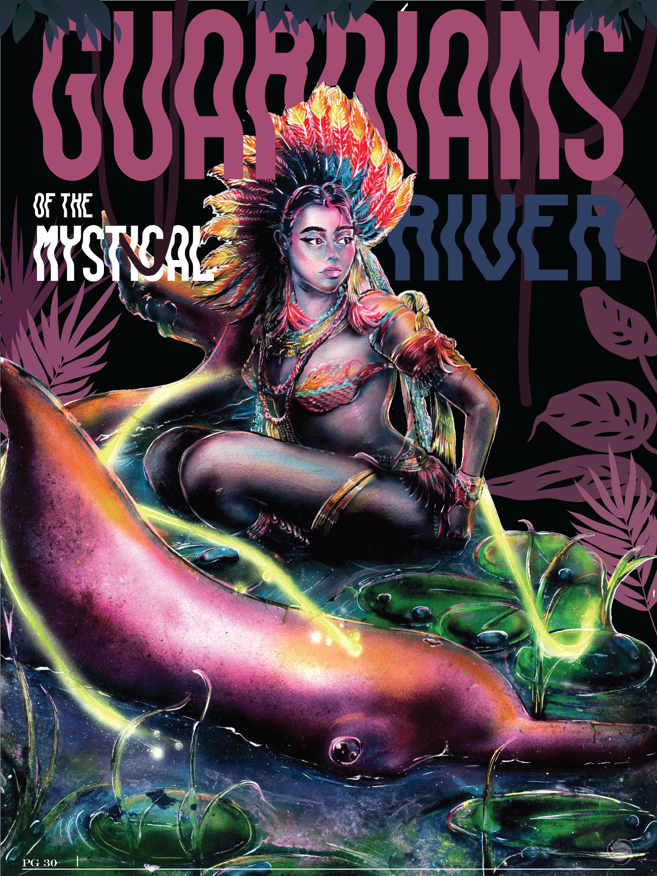
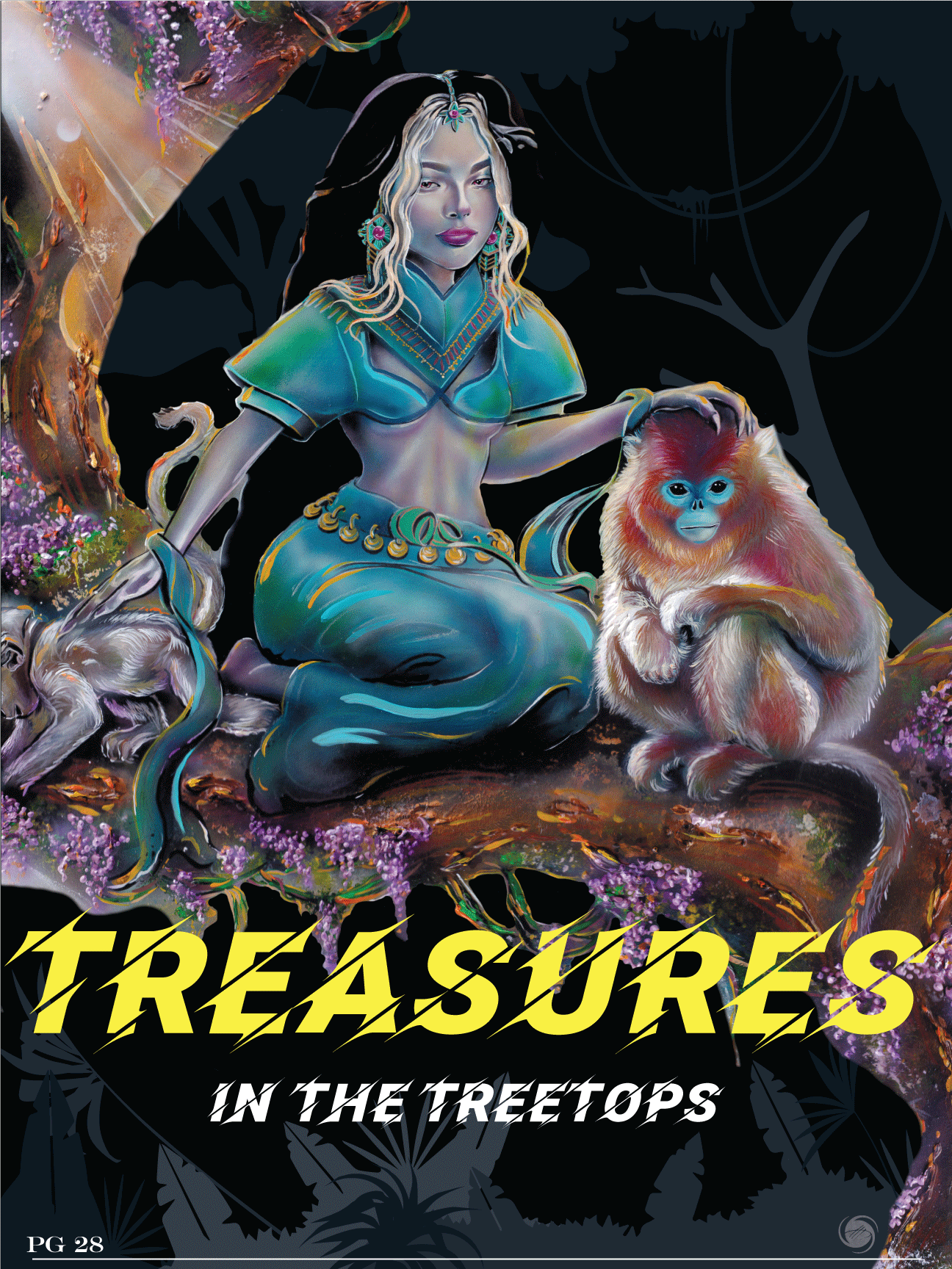
Utilize a lively and rich color palette to evoke a sense of energy and vitality, ensuring that each illustration stands out and grabs the reader's attention


02
Unconventional Animal Choices:
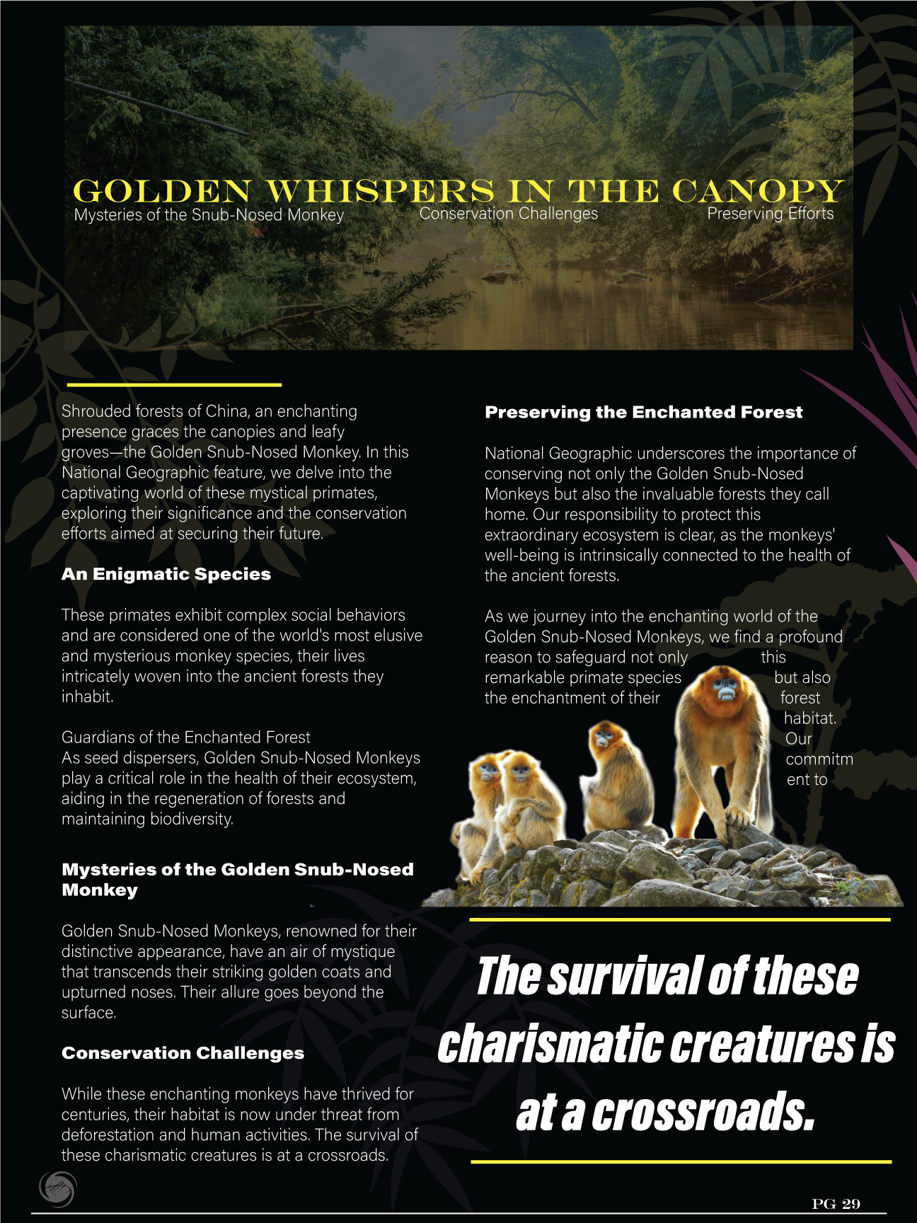
Feature illustrations of unique and less commonly known species, such as the pink dolphin and the snub-nosed monkey, to spark curiosity and educate readers about the diverse and often endangered wildlife.
Key Features of Magazine Spread:

The Impact
The revitalized space exhibit, as depicted in your illustrative graphic concept, has successfully rejuvenated the science center's appeal among families, especially drawing in a new wave of younger attendees.
The interactive and visually captivating nature of the exhibit not only sparks interest but also fosters a love for science and space exploration in the next generation.
03
Narrative Through Art:
Arrange your illustrations in a way that tells a story about the importance of conservation, emphasizing the interconnectedness of ecosystems and the role each species plays.


04
Incorporate Infographics:
Include visually appealing infographics that provide key facts about the highlighted animals, their habitats, and the current conservation status, combining education with aesthetics

Conclusion
Through the lens of this case study, I’ve showcased not only my design skills but also my ability to address real or imaginary challenges through thoughtful and innovative graphic solutions.
This approach hopes to demonstrate an awareness of current trends and a capacity to create designs that resonate with specific target audiences.

.jpg)

